Executive Summary
Enterprise UX rarely gives you room to experiment. Client timelines, NDA constraints, and sprint velocity all compress the space for exploration. Design Lab is where that space lives.
These are self-initiated prototypes — built in response to a real shift I noticed in client engagements: stakeholders increasingly want coded proof-of-concepts, not Figma screens. So I started building them. What began as a practical response to a changing deliverable expectation became something more interesting: a practice of using code as a design tool, exploring AI interaction patterns that don't fit cleanly into any current client roadmap, and maintaining a body of work I can actually show when NDAs block everything else.
Both prototypes below are fully functional HTML/CSS/JS builds, designed and developed end-to-end without a development partner.
Doc360
An AI-native document intelligence viewer for UnitedHealth Group
The Problem
UHG's existing document management experience was built for retrieval, not understanding. Users could find documents — but extracting meaning across a large corpus required manual reading, ctrl+f searching, and cross-referencing across multiple tabs. As AI-assisted summarization and semantic search became viable, there was no design language for what that experience should actually feel like.
What I Built
Doc360 is a fully interactive document viewer prototype that explores what AI-native document intelligence looks like at the enterprise level. It includes semantic search with contextual result ranking, an AI summary layer that surfaces key clauses and flags anomalies, a side-by-side document comparison mode, and a persistent chat interface for querying document content conversationally.
The interface is UHG-branded and desktop-optimized, designed for the operations and compliance personas who live in documentation all day.
Why I Built It
Two reasons. First, a client engagement surfaced a direct ask for a coded POC demonstrating document intelligence patterns — and I wanted to be able to respond with something real, not a Figma prototype behind a "this would be clickable" disclaimer. Second, this interaction space — AI as a reading companion rather than a search engine — is one I find genuinely underdesigned in enterprise healthcare. Doc360 is my attempt to define what good looks like.
What It Demonstrates
End-to-end prototype capability · AI conversation UI patterns · Information architecture for large document corpora · UHG design system fluency · Enterprise desktop UX

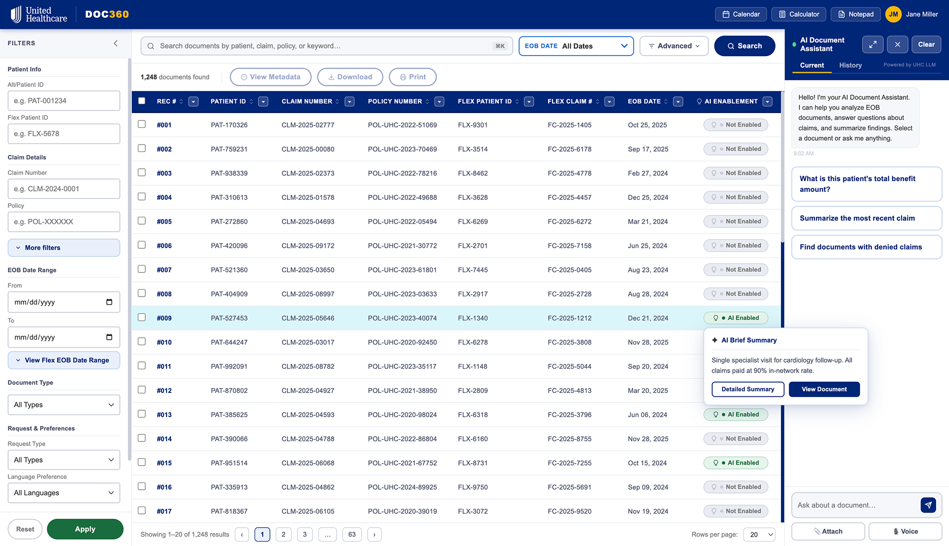
The main screen of Doc360. Upon hovering an "AI Enabled" document, they will see a brief summary with additional actions.

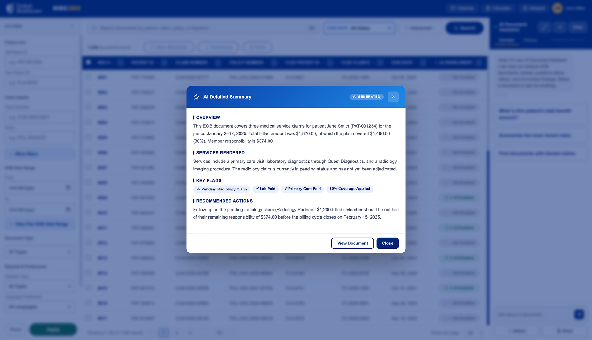
Upon viewing "View Brief Summary", the user can view a quick synopsis of the document.
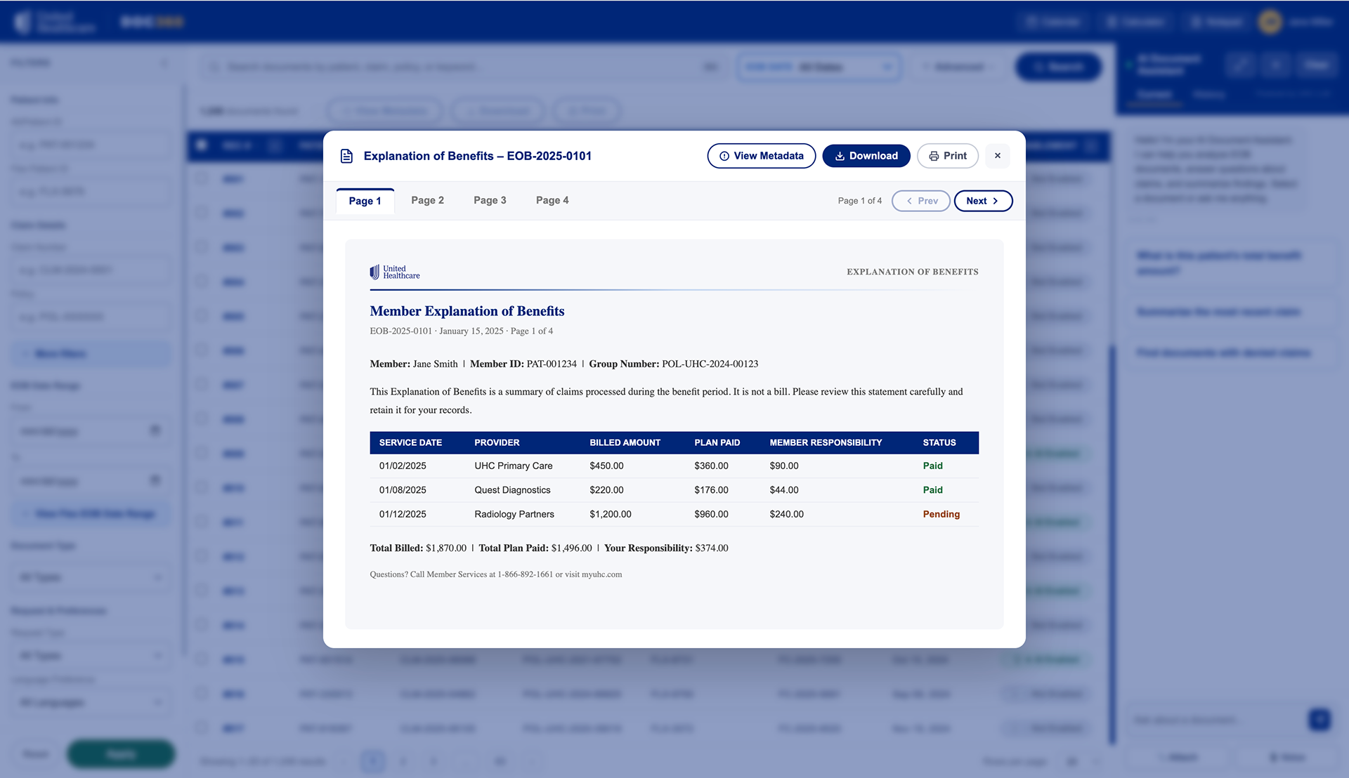
If the user wishes to view it in full, they have the option to do so along with other actions such as download, print, view metadata, and exit.
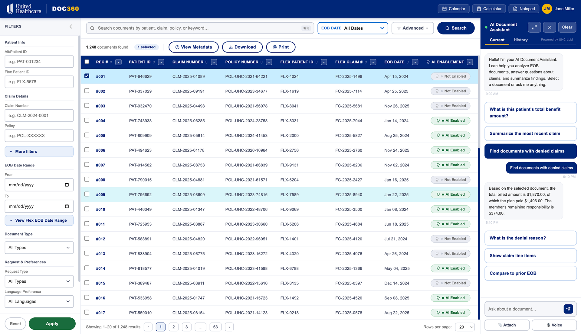
The AI Document Assistant has preloaded questions and can assist the user as needed.
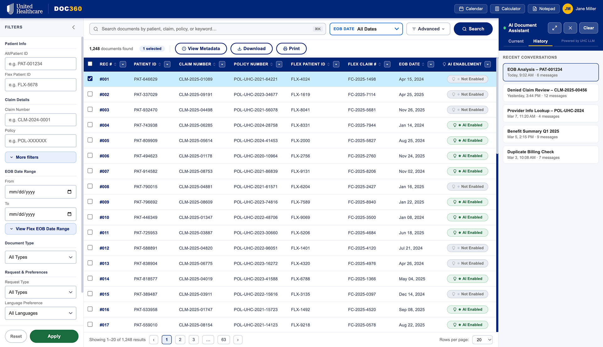
In addition, the user history is kept for convenience.
Medicare Plan Finder
A "Try Before You Buy" plan selection experience for Medicare beneficiaries
The Problem
Medicare plan selection is one of the most consequential UX problems in American healthcare — and one of the worst-designed. Beneficiaries face a wall of plan options, dense comparison tables, and no way to understand what coverage actually means for their specific situation before they commit. The existing UHG plan finder experience reflected this: functional, but not empathetic.
What I Built
Medicare Plan Finder is a guided, AI-assisted plan selection prototype I internally called "MediGap for You" — a try-before-you-buy flow that lets users input their actual medications, providers, and health priorities, then surfaces a ranked shortlist of plans with plain-language explanations of tradeoffs. The experience uses progressive disclosure to reduce cognitive load, and an AI recommendation layer to translate actuarial complexity into human terms.
Why I Built It
This prototype exists at the intersection of two things: deep familiarity with UHG's Medicare product landscape from my Intelligence Hub work, and a conviction that the plan selection experience is a solvable problem with the right interaction model. It's also cleanly non-proprietary — everything here is speculative design against publicly available Medicare data structures, which means I can show it without NDA concerns.
What It Demonstrates
AI-assisted decision support UX · Healthcare consumer product design · Progressive disclosure patterns · Plain language design for complex information · Empathy-driven onboarding flows

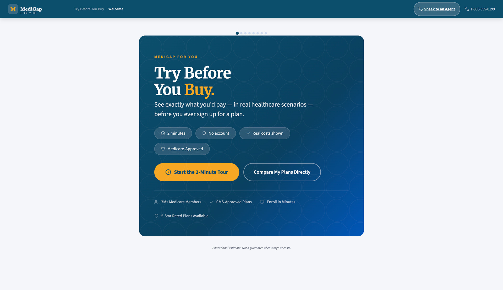
The main landing screen. Here, the user can choose a 2-minute tour which will aid them in deciding their MediGap plans, or compare plans immediately.

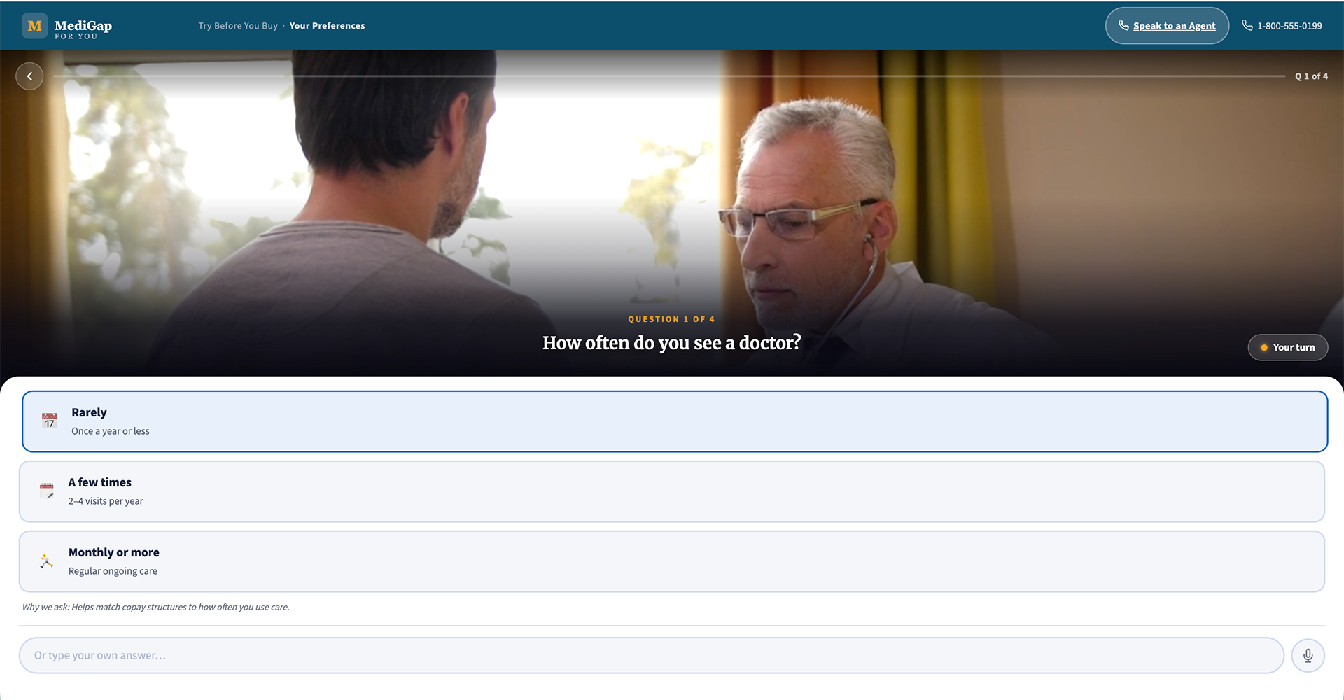
During the walkthrough, the user will go through 4 questions, and they can respond by clicking, writing their own answer, or voice to text.

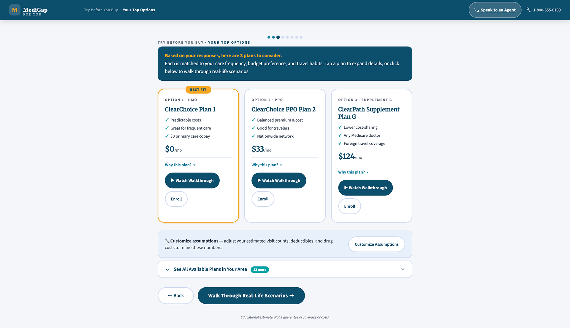
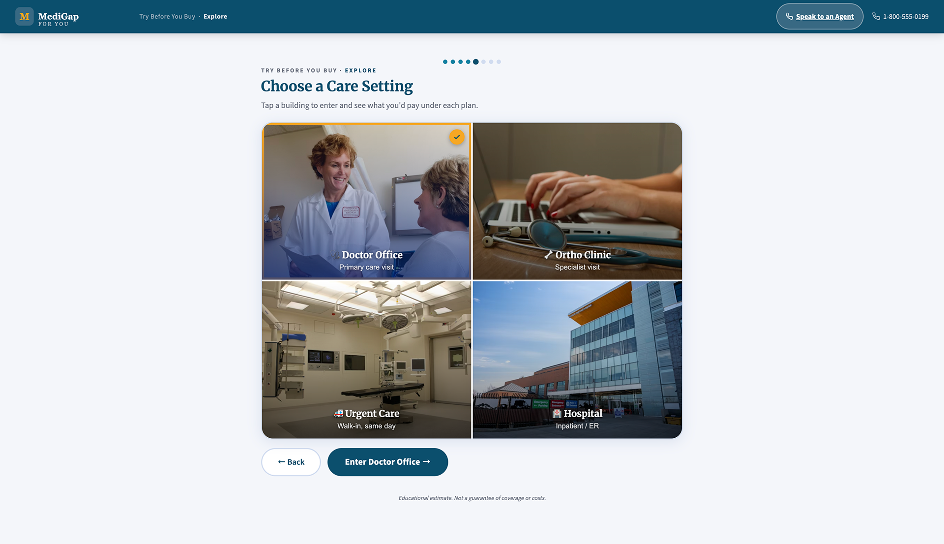
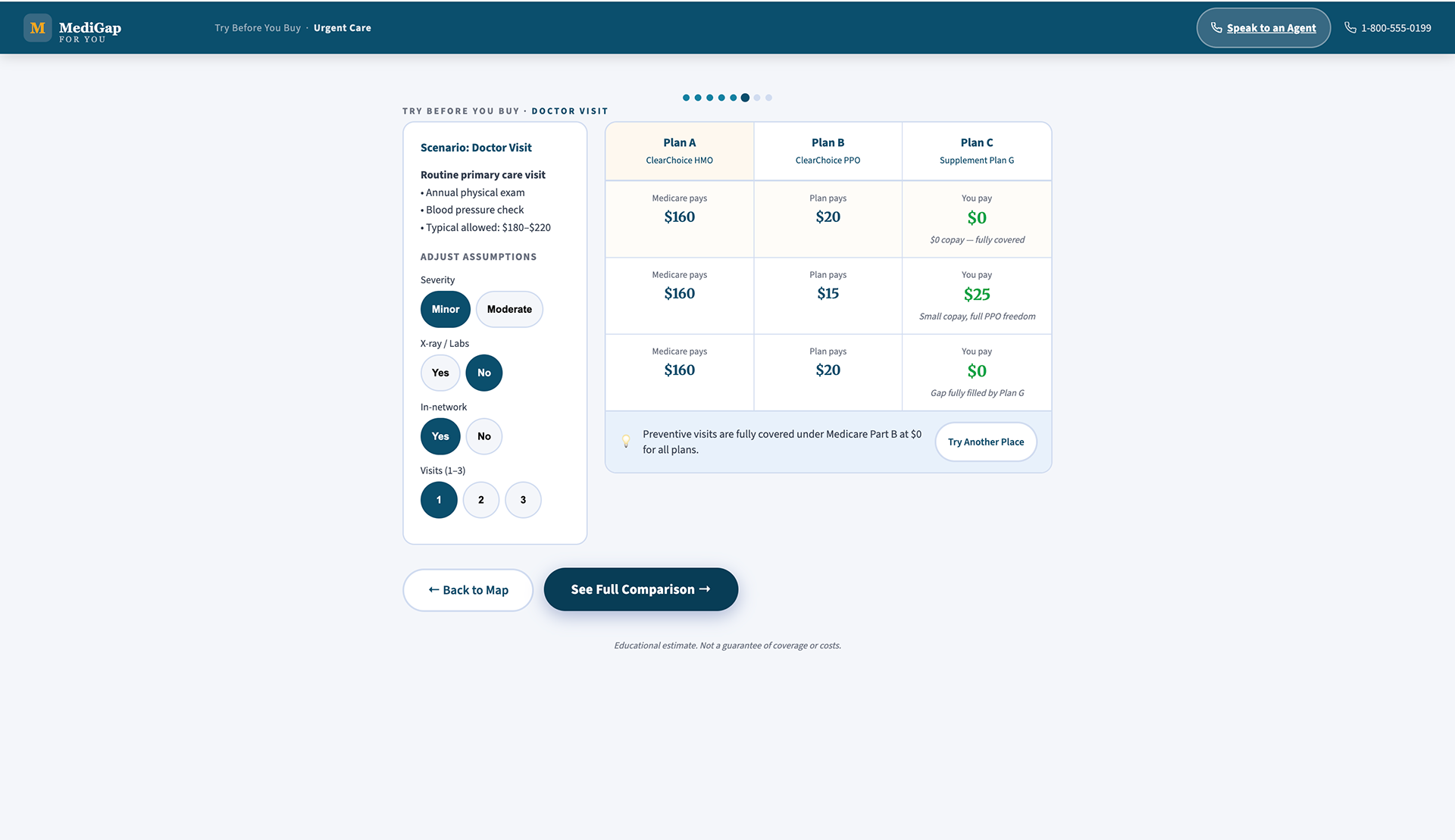
Here, the user can see their top 3 plans based upon what they responded to. They can see more available plans in their area, customize assumptions, or watch a walkthrough of the plan - this is where our user will "Try before they buy".

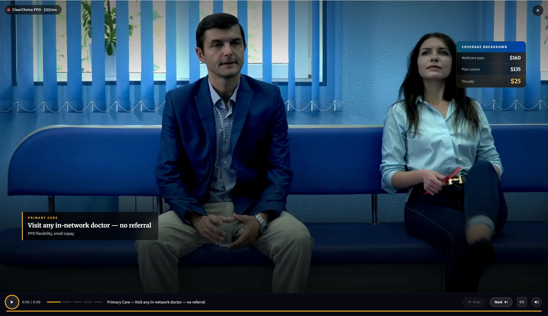
Upon clicking "Watch Walkthrough" the user will get an immersive walkthrough of the plan, allowing them to "try before they buy".

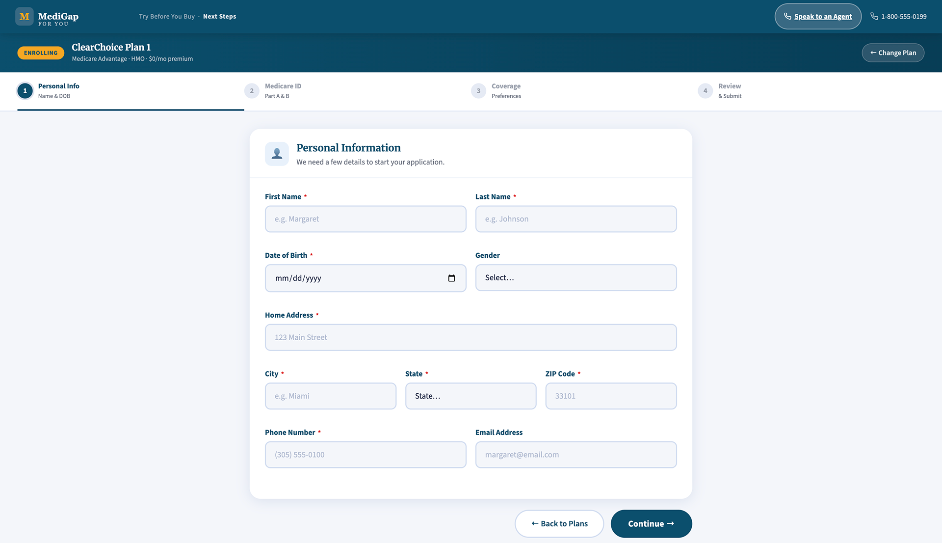
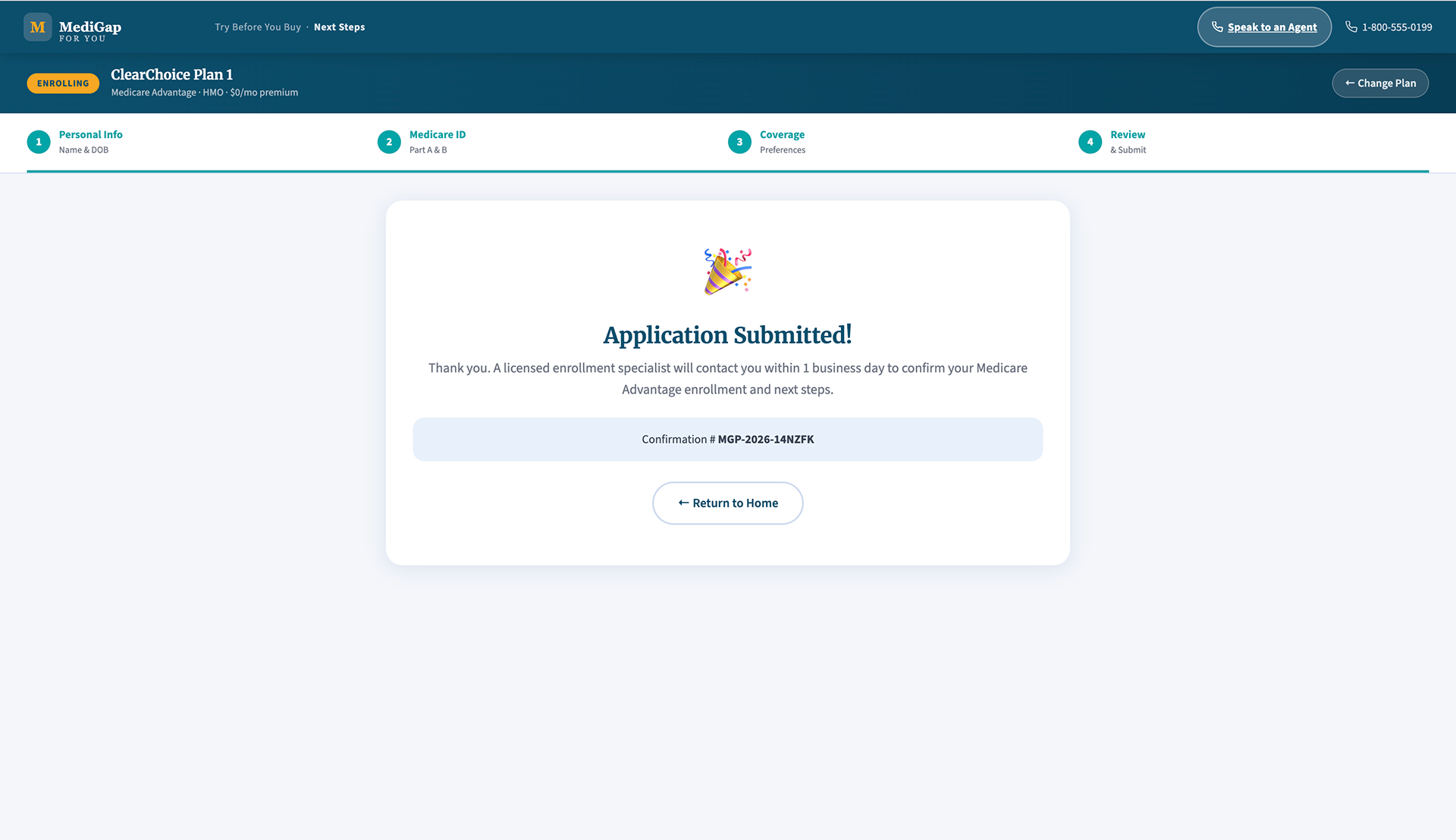
Upon choosing to fill out their application, they will go through a thorough process.
Upon completing the application, the user will get a confirmation screen.
Both prototypes are available for walkthrough during interviews. Reach out via the contact link below.
Submit
Thank you!
Back to Top