Duration:
8 months (July 2022-February 2023)
8 months (July 2022-February 2023)
Team:
2 Project Managers, 2 Account Managers, 2 UX Directors, 2 Art Directors, 2 UX Directors, 2 Editors, 1 Animation Studio
2 Project Managers, 2 Account Managers, 2 UX Directors, 2 Art Directors, 2 UX Directors, 2 Editors, 1 Animation Studio
Tools:
Veeva Interactive, After Effects, InDesign, Illustrator, Photoshop,
Veeva Interactive, After Effects, InDesign, Illustrator, Photoshop,
Areas of Focus:
Motion Design, UX Design, Interaction Design, Usability Testing
Motion Design, UX Design, Interaction Design, Usability Testing
Executive Summary
Problem
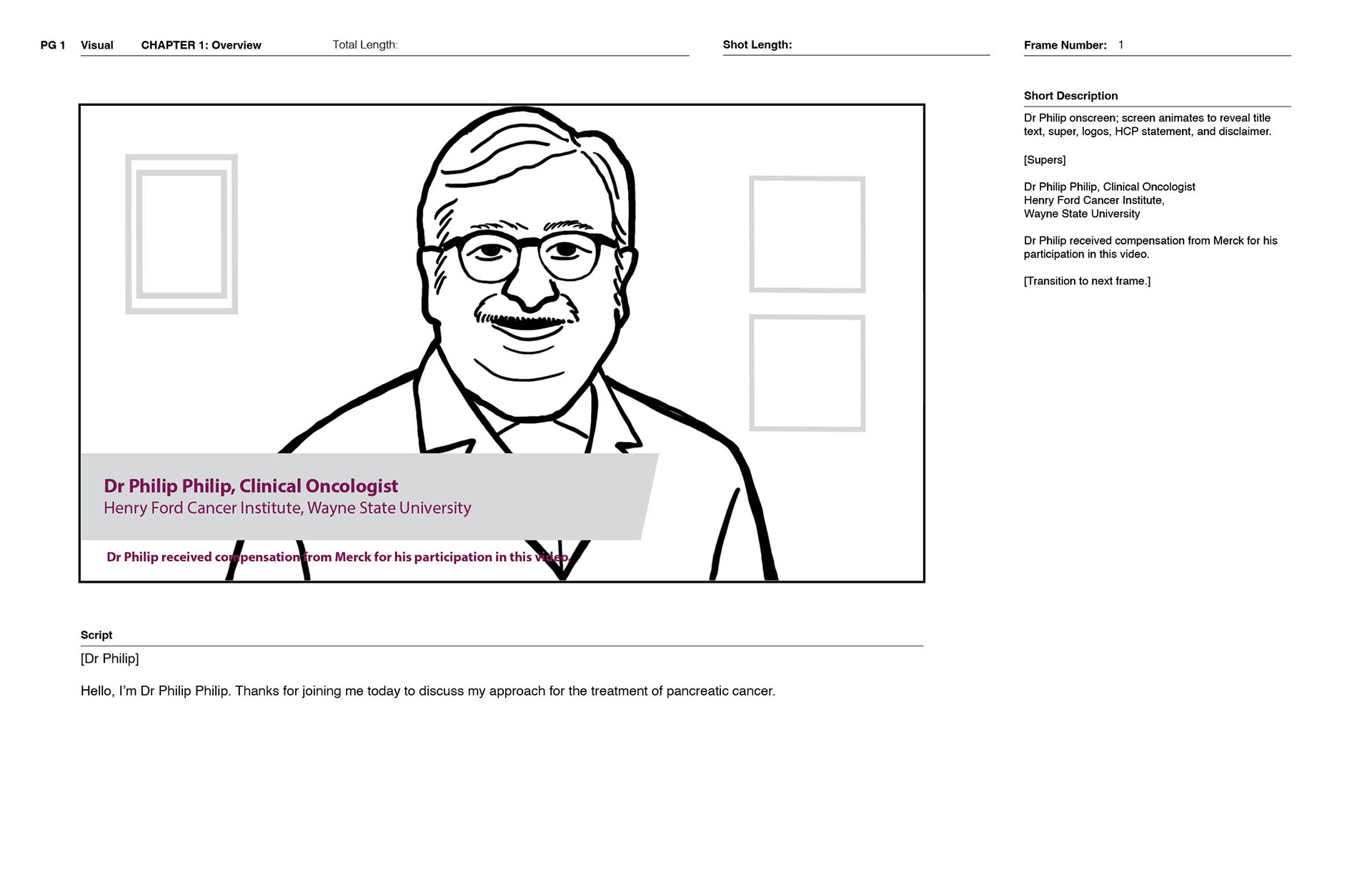
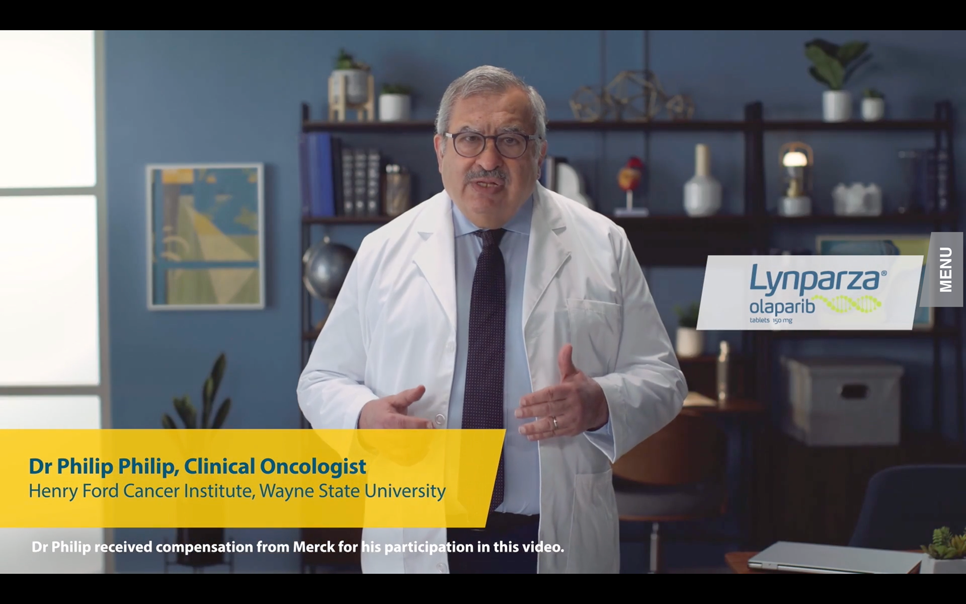
AstraZeneca and Merck needed a new way to reach healthcare professionals about LYNPARZA — their treatment for metastatic pancreatic cancer. The challenge wasn't the science. It was the format. Traditional pharmaceutical sales materials — static PDFs, linear videos, printed leave-behinds — weren't built for how HCPs actually engaged with clinical content: selectively, on their own schedule, driven by the specific questions relevant to their patients.They needed something that could hold a complex clinical story and let the user navigate it on their own terms.
My Role
My Role
I was one of two designers at our agency trained in Veeva Interactive (Wirewax) — the platform used to make video interactive for pharma sales environments. In practice, I was the one running it — and I was the first. When I joined the project, the video had been in production for some time but hadn't yet been made interactive. I was the first person to upload the footage into Wirewax, animate the interactive layer, and deliver a working rough cut of the experience. Every interactive version that followed was built on that foundation.
Beyond the platform, I owned the interaction design and motion work end-to-end:
Designed and maintained the chapter navigation UI — the interactive menu system that gave HCPs non-linear access to the video's content
Led motion design for the interactive elements overlaid throughout the video
Managed the storyboard alongside the art directors and copywriters, ensuring it accurately reflected the interactive experience at every revision
Handled all handoff to developers
What started as a 35-minute video when I joined grew to 40 minutes of final content — a scope expansion that reflected both the client's growing confidence in the format and the increasing demand to tell a more complete clinical story.
Solution
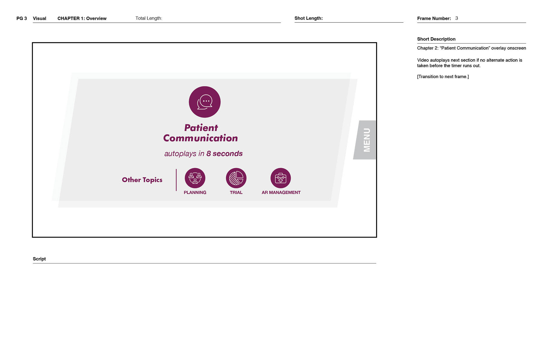
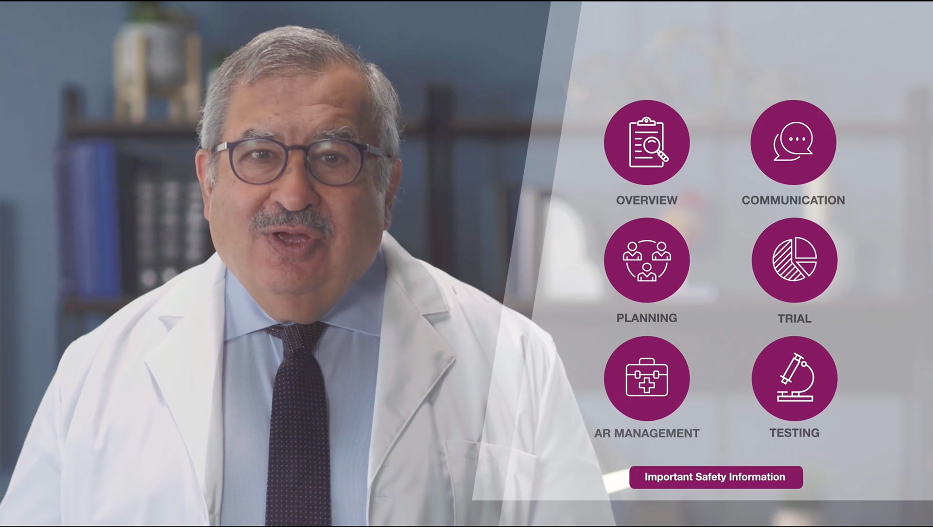
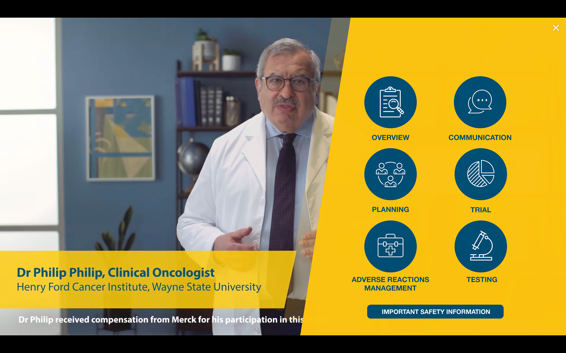
The Dr. Philip Interactive Experience: a 40-minute Veeva Interactive video that gave HCPs chapter-based, non-linear access to AstraZeneca and Merck's clinical narrative for LYNPARZA. Users could navigate to the topics most relevant to them — efficacy data, mechanism of action, patient selection — without sitting through content they didn't need. An animated chapter menu pulled out on demand, letting users move through the experience at their own pace.
The live experience is no longer publicly accessible following the campaign's conclusion. What's shown here is the final delivered video, storyboard documentation, and motion design work from the interactive layer.
Phase 1: Storyboard — Building the Blueprint for Interactivity
Interactive video in pharma isn't like interactive video anywhere else. Every claim is regulated, every visual is routed through medical and legal review, and every update to the content can cascade into changes across multiple interactive states. The storyboard wasn't just a production document — it was the contract between the creative team, the client, and the interactive layer I was building.
I worked alongside the art directors and copywriters to maintain and update the storyboard throughout the project, ensuring it reflected not just what the video would show, but how it would behave. Each revision had to account for the interactive logic: what happened when a user clicked a chapter, what state the menu was in, what content was visible at any given moment. A change to the video was always also a change to the interaction design.
The storyboard went through numerous routing cycles — medical, legal, regulatory — before content was locked for production. By the time we handed it to the animation studio, it was a precise specification for both the film and the interactive layer built on top of it.
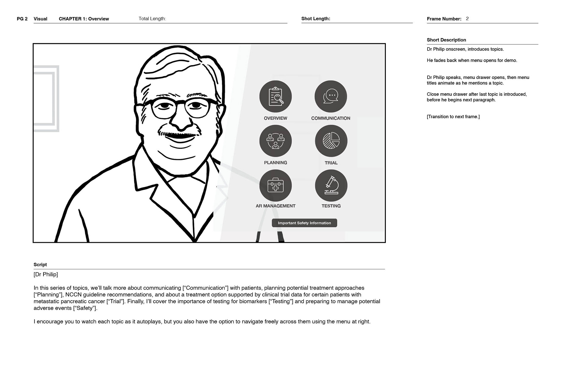
Phase 2: Interaction Design — The Chapter Navigation System
The core UX challenge on this project was deceptively simple: how do you give a user control over a 40-minute video without making them feel like they're operating software?
The solution was a persistent chapter menu — designed to feel like a natural extension of the video rather than a UI imposed on top of it. The menu sat collapsed during playback and expanded on demand, presenting the available chapters clearly enough that an HCP could orient themselves, select what they needed, and return to the video without friction.
I designed and iterated on this menu system from the ground up — building the first working version in Wirewax from scratch when I joined the project with 35 minutes of video already in production. What made this genuinely difficult wasn't the initial build — it was what came after. Pharma video production moves through constant revision cycles: dialogue changes, regulatory feedback, updated clinical claims. Every time a line of dialogue changed, I had to update the motion work in After Effects, re-time the animations to match the new audio, and rebuild the corresponding interactive states in Wirewax. A single content change could cascade through the entire interactive layer. I managed every one of those updates across the full 8-month run.
The interaction design had to work within constraints that most product designers never encounter: a pharma sales environment where the video plays on a rep's tablet in front of a physician, where any navigation failure is a credibility failure, and where the experience has to feel polished enough to represent two major pharmaceutical brands.
Phase 3: Motion Design — Animating the Interactive Layer
The motion work on this project was the thread connecting the video to the interactive elements. Static overlays in a clinical video feel like an afterthought. Animated ones — when done well — feel like the video itself is responding to the user.
This wasn't work inherited from another designer — I built the motion layer from the first frame, establishing the visual language for how the interactive elements would behave before anyone else had touched the platform.
I was responsible for the motion design of the interactive elements throughout the experience: chapter indicators, transition states, menu animations, and the visual feedback that told the user their interaction had registered. Each animation had to match the production quality of the underlying video while remaining functional enough to serve its UX purpose.
After Effects was the primary tool for this work. The motion had to be precise — too slow and it felt unresponsive, too fast and it broke the clinical tone the brands required.
Phase 4: Handoff
With the interaction design finalized and the motion work complete, I handled handoff to the development team — providing specifications, assets, and documentation for how each interactive element should behave in the final delivered experience. Given the regulatory environment, the handoff had to be thorough: there was no room for interpretation in a medical-legal-reviewed piece.
Outcomes
The Dr. Philip Interactive Experience launched and was deployed in the field for AstraZeneca and Merck's sales teams. The format — a non-linear, chapter-based interactive video for HCP engagement — was novel enough at the time that our agency had only two people trained to build it, and I was the one who built the first version.
The video's growth from its original length to 40 minutes of final content across the project's 8-month run was the clearest measure of client confidence in the format. You don't expand a video's scope on a project you're not invested in.
Reflection
On interactive video in regulated environments: the constraint is the creative.
Pharma creative work is constrained in ways that push back on almost every instinct a designer has. Every visual claim needs substantiation. Every interactive state needs to survive medical and legal review. Every animation has to earn its place in a clinical context where the audience is skeptical by training and pressed for time.
What I found is that those constraints don't make the work less interesting — they make it more precise. The chapter navigation system had to be simple enough that it didn't distract from the content, robust enough to handle a 40-minute video, and polished enough to represent two global pharmaceutical brands in front of physicians. That's a tighter brief than most product design work I've done.
On owning a tool that nobody else knew:
Being one of two Wirewax-trained designers at the agency — and the one who originated and ran every update — taught me something about the value of technical specificity. General design skills are common. Knowing a specific platform deeply enough to be the person who builds the first version, then keeps it running under pressure across an 8-month revision cycle, is something different. I've carried that forward: whenever I'm working in a new technical environment, I make it my business to understand it well enough to own it.
Credits:
Art Direction: Rocky Reed, Tim Panicucci
UX: Brittany Ekdahl, Arek Zarycki
Account Services: Samantha Harris, Tim Durishin
Editorial: Jason Haque, Edward McLane-Haraz
Animation and Voiceover: Alice Blue
Company: AstraZeneca and Merck